Categories
Tech (General)

Will Touch Screens Ever Take Over?

I tend to agree with David Pogue in his latest Scientific American piece on why touch screens will not take over. Perhaps it is possible for touch screens to solve for all these problems, but I think the energy could be better spent on something superior to touch screens.

It’s not that I think touch screens are going away, I just don’t think it’s the ideal medium for larger touch screen interfaces. In my mind, the Iron Man J.A.R.V.I.S. is the perfect example of where we will eventually get. Where AI (Siri’s mature brother) and touch interfaces have merged to become a more intuitive and usable user experience.

Touch does have it’s place in interaction, both in the physical world as well as the cyber world. However just as we don’t feel our way through the world, I don’t think touch screens will ever be a solid solution for interacting with technology. We’ll find a hybrid that lets the user decide what method works for them at a given moment and a given task.

Categories
Apple

Why Letterboxed iPhone 5 Drive Me Nuts

For those who haven’t upgraded to the iPhone 5, allow me to illustrate why apps on the iPhone 5 that haven’t been updated are frustrating.

Categories
Apple

iPad Keyboard Prototype

iPad Keyboard Prototype

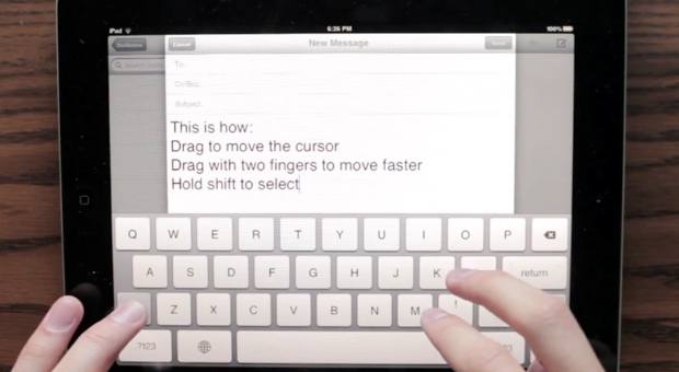
Here’s a great little prototype keyboard someone is proposing for the iPad. I’d love to see this in a future iOS release. The only thing it doesn’t address is the complex problem of autocorrect, which it strangely points out early on. Even still, it’s a great improvement to text selection. Apple should hire the person behind this for some UX work.

Categories
Software

Evil Registration Codes

I hate having to use registration codes when installing software, but have accepted it as the way things work.

Today however I got to enter one that’s 80 characters long. That’s right, 80.

Nothing says “we hate our customers” more than making them enter 80 random characters into a text field before they can install the product they purchased.

Categories
Software

Twitter Client Gripes

Like many in my trade, I keep a Twitter client open all day. 140 characters works very well between compile times, reloads, uploads. I still use RSS extensively, but Twitter fills the gaps nicely as my brain is always looking for information to absorb (feel free to follow if you don’t).

To this day it amazes me that I can’t find a perfect Twitter client. Tweetie back in its day was pretty damn close, but since it was bought by Twitter, it went downhill to the point of being unusable on the iPhone. Amazingly priced at “free” it’s not worth the price. These days TweetBot is as close to perfect as I can find on the iPhone and I’d recommend it to anyone who is frustrated with Twitter for iPhone.

Largely due to neglect the Mac client is still usable to me, however it’s hardly awesome. Why doesn’t “command /” reliably bring the window to focus? Why can’t I set my preferred URL shortener? The developer console has lots of weird select and focus issues. I could go on…

From where I sit, these are the most annoying things Twitter still hasn’t figured out:

  • Search Blows – This one everyone always complains about. Search isn’t good, and only goes a few days back. It’s a miserable experience.
  • Amnesia – Twitter has a very limited memory. You can only search a few days back. Your timeline can only go so far back. Even DM’s can only be retrieved a mystery period back. Everything eventually disappears. I actually backup my tweets to a MySQL database so I can search anything I’ve ever tweeted. Most don’t have this luxury. Perhaps they should just partner with Google and let Google handle their archive/search problem. Let Google pay for the data, and for the right to solve this problem.
  • DM Downgraded – This one is pretty specific to the new Twitter “Let’s Fly” UI. Direct Messages, are very obscured and buried. Yea I get it, you want everything out in the open. It’s annoying however to hide useful and sometimes important UI.
  • Incomplete Clients – There’s no interface that seems to do everything. If you want to know how many RT’s or Favorites posts have, the best UI seems to be the website. If you want to use a custom URL shortener, Twitter for iPhone has you covered. Twitter for Mac has no UI to show what client a tweet was created with, mobile with its limited screen size does. It also has no way to see RT stats for a tweet. Want to be notified when you have a mention or DM? iPhone or desktop client is best (that’s not the web clients fault). Amazingly these UI’s all come from the same company. Facebook (now) does a pretty good job on feature parody across web/mobile clients.
  • What are favorites/lists – I don’t think anyone has fully figured out what these really are and how they should be used. Is there a value to maintaining a list? It seems most use favorites as bookmarks to read later, some use it for marking tweets they really like. I know I’ve done both. Facebook hasn’t figured out lists completely either, though I feel they’ve at least given them a useful purpose for power users.
  • Spam – I think if a user signs up and just @replies a link to 50 people, an algorithm should be able to detect they are a spammer and stop it.
  • Placeholder – The thing that annoys me the most is they still haven’t figured out how to leave a placeholder on your timeline. Why can’t I just pickup where I left off? I need to search for it. Facebook never solved for this problem either. Amazon’s Kindle (and apps) solved for this brilliantly. Surely Twitter could adopt an API to solve for this. As someone who restarts their browser often due to work I’m doing, this makes the web UI unusable.

So what am I ignoring in terms of annoying Twitter client things?

Categories
Web Development

Make Login Pages Autofocus

I see this way too often and it gets on my nerves. If you have a page that’s main purpose is a form, such as a login page, please make the page autofocus to the first field in the form. Having to tab or click on the first field is a nuisance. Even big sites make this mistake.

If you don’t care about IE you can do it as simply as:

<form method="post" action="/">
<p>
    <label for="username">Username:</label>
    <input type="text" name="username" id="username" autofocus="autofocus"/>
</p>
<p>
    <label for="password">Password:</label>
    <input type="password" name="password" id="password" />
</p>
<p><input type="submit" name="login" value="Login"/></p>
</form>

Since autofocus is boolean you technically don’t even need to specify an attribute value.

To do it with IE in mind you could use the following JavaScript below the form (no library needed):

function focusForm(){
    setTimeout(function(){
        try {
            // id of element to focus on
            var elem = document.getElementById(‘username’);
            elem.focus();
            elem.select();
        } catch(e){}
    }, 50); // setTimeout to fix IE bug
}
focusForm();

Note the use of select() so if the form reloads due to an incorrect password the field is not just in focus but the contents highlighted. There is also a setTimeout() since IE, at least some older versions have trouble with this if it happens too quickly. 50 should be fast enough that it won’t be noticed by humans.

See how simple that is? No excuses for not fixing this 😉 .

Categories
Apple Hardware

Define Mute

One of the tricky things about building products is defining the details. When you say “mute switch” as you’d see on a phone like the iPhone, what exactly do you mean my “mute”? App sounds? Calls? What about an alarm? Muting an alarm sounds reasonable, but perhaps the reason for using the switch is so you can sleep until your phone wakes you up in the AM (I suspect that’s actually a very common use case).

John Gruber has a pretty good insight on the iPhones mute switch design, which doesn’t cover alarms as one New York Philharmonic audience member learned the other night. I agree that it’s an edge case, however think an alert the first time you switch it (and then never again) would be a reasonably good UX. Doing so every time as he explains wouldn’t be workable since you often do use the switch without taking your phone out of your pocket. I know I do it all the time.

In “the old days”, you’d just make that a 3 way selector: mute all sounds, mute all but alarm, all sounds on. 5% of users would figure out how it works.

Categories
Apple Security

Smartphone Guest Mode

A very good idea by Greg Kumparak on TechCrunch:

Here’s the dream: one lock-screen, two PINs. One for me, one for anyone else who might use my phone but doesn’t necessarily need to see everything.

Not only is it a good idea for there to be a guest mode, the implementation is quite nice and simple. Maps, Phone, Clock, Calculator, Safari. Perhaps the ability to granularity add/remove from that default set. Everything is stateless and rest when guest mode ends.

This could potentially even lower the divorce rate in the US.

Categories
Rants Tech (General)

Confession: I’m A Touchscreen Snob

Continental Touchscreen

I’m a touchscreen snob, and I bet you are too. I bet every human being is. We get upset when things don’t react as expected and we get frustrated when things aren’t instant. Statistically this page loads on average under 2 seconds and it’s likely still too long for you. It’s not just touch screens. For example, 100 MS increase in load time of Amazon.com decreased sales by 1%. We’re an impatient species.

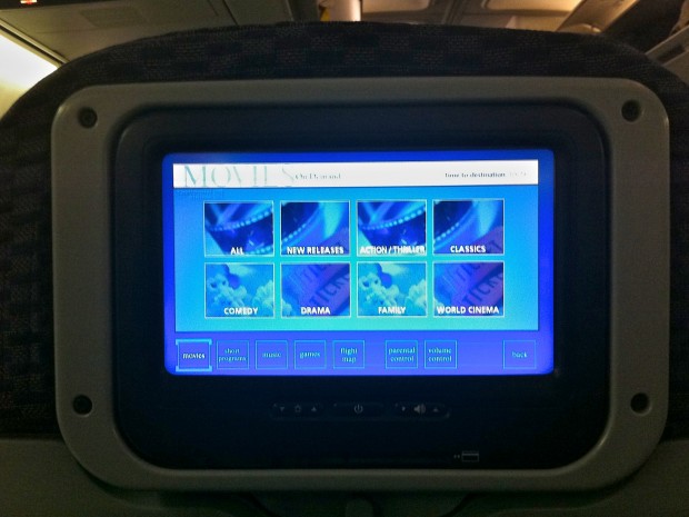
I took the above photo on a 757-200 equipped with touch screens on the back of every seat. I remember the days with only a handful of TV’s, or that big projector thing up front on planes, so I appreciate that a choice of entertainment is an upgrade. Lets take a look at it’s sins as it makes a great example:

Resistive Touchscreen

I’m virtually certain based on it’s poor performance it’s a resistive touchscreen. Unresponsive, and it requires a lot of pressure which the person in the seat in front of you enjoys for 8 hours. Resistive touchscreens are much more cost effective, though I wonder that difference is splitting hairs on a $65-80 million aircraft given there are only ~200 seats and the displays are relatively small.

There was a time when nobody would notice, but even a Droid v1’s touch screen is more responsive, and that phone is extensively laggy.

Poor Contrast

Part of this is likely because of the substrate used for resistive touchscreens, but the poor contrast is obviously an issue. Color reproduction is bad, but that’s not a deal killer, it’s a nitpick. Contrast is critical especially on a vehicle where lighting varies from dark to virtually unfiltered sunlight glaring on the display. Contrast controls are minimally helpful here.

Laggy

I suspect these are units are just terminals, so the performance can sometimes lag. It’s forgivable and likely will not be an issue in future generations. Thanks to the mobile revolution low powered ARM chips can be found everywhere. The need for these things to be dumb to save space and power is drawing to a close.

Sound

I’ve yet to figure out why airlines can’t manage to get rid of the noise in the lines. Sure when you use the $0.25 headsets they hand out you can’t tell the difference. But when you use your own higher quality headset you sure can. Given a cheap MP3 player can manage it, I wonder why this is so difficult. Weight?

My second gripe about sound is the volume differences. The movie is set to a comfortable level. If the crew takes over to show a video of your destination or a safety video, it’s uncomfortably loud. If the captain speaks, it’s painful. This is more than a nuisance, this is actually a safety issue.

Categories
Google

Google Instant = Web Command Line Interface

“What’s old is new again” the saying goes. Google Instant is a pretty interesting UI change. One of the big things mentioned is that all you need to do is type “w” and you’ll see the local weather. A way to get information by just typing… some of us know that as command line interface.

Essentially we’re seeing Google move from a point & click UI to almost a command line UI. For ages the focus was automatically set on the search box, no need to click on it. Just type, press enter or as I’m sure many (if not the majority did) mouse over the “search” button and click on it and you got search results. It’s just another step forward in simplifying the process. This is one less interaction (pressing search).

It’s interesting to see a less mouse centric UI develop after decades of anti-keyboard UI. For those of us comfortable typing quickly and using keyboard shortcuts constantly it’s a constant nuisance when applications don’t handle shortcuts nicely. We’re now seeing an effort to reduce use of the mouse, even if it’s just to press the “Search” button. One less reason to take your hands off the keyboard.

One interesting quirk I’ve noticed is Google’s calculator (the ability to type a math problem into Google and get an answer) just feels awkward and unpolished. I suspect they will improve upon that shortly. This can vastly improve the utility of these little applications. Google has several little apps built into its search (try typing “movies” for example). It’s just that much easier to use.