I wanted to take a few minutes to discuss HTML5 Boilerplate, a template that’s rapidly going around the web development community. I’ve had a few email threads and chats about this recently and thought I’d just put all my thoughts together in one place now.
I’ll start by saying it’s not a bad template. It’s actually quite good and encompasses many best practices as well as incorporates fixes for many common problems (clearfix, pngfix). What I’d like to make note of is that it’s not really bringing you HTML5 and lots of what it does has nothing to do with HTML5.
Not Really HTML5
For starters you’re not really getting HTML5. HTML5 Boilerplate uses JavaScript library called Modernizr. As their website explains:
Modernizr does not add missing functionality to browsers; instead, it detects native availability of features and offers you a way to maintain a fine level of control over your site regardless of a browser’s capabilities.
It also lets you apply styles to the new semantic HTML5 elements like <header/>, <footer/> <section/>.
What don’t you get? Well for starters you’re missing <canvas/> and <video/>. Other than tag elements you’re also missing things like Gelocation, Drag&Drop, web storage, MathML, async attribute on <script/> to name a few. SVG?
Pretty much all the headliners in the HTML5 spec aren’t included. Some like <canvas/> could be helped by way of explorercanvas, but that’s not in there by default.
HTML5 Boilerplate also makes reference to things like Access-Control which still doesn’t work in older browsers. They also suggest setting mimetypes for HTML5 video. This isn’t by any means bad, but hardly makes <video/> useful to everyone. Browsers are still pretty fragmented between webm, ogg, and h.264 (mp4). Then you have older versions that support none of these.
Using gzip on ttf,otf,eot files seems to be a good idea. WOFF however are compressed and correctly excluded.
WTF Does This Have To Do With HTML5?
There are lots of things that I would consider best-practices, but would hardly consider to be HTML5. For example pngfix for IE6, .clearfix, apple-touch-icon, console.log wrapper being the most obvious.
Setting far-future cache times are good, and disabling Etag is a good idea, assuming you rename the file every time it updates. But what does this have to do with HTML5? Is this even practical for everyone?
Then there is some interesting css work like inline print block. There are also a couple of nice usability fixes that I like. Regardless, they are just good design and UX. Not HTML5.
As for the graceful degradation and mobile optimization… that’s design and css. There is no reason why any HTML4 or XHTML site couldn’t do that today. Most choose not to do so in favor of serving different content (including ads) to different devices.
Options -MultiViews… grumble. I’m not particularly fond of it, but again if it works for you, I wouldn’t push you away from it.
Removing www… I hate this one. In my experience the only people who insist upon this have never dealt with websites with high volume and had the requirement of using a CDN by way of a CNAME in front of your site (your domain must be an A record). What is the real benefit here other than some sort of URL ascetics? I’ll let you in on a little secret: The IP address for this blog is hardly maximizing feng shui.
Best Practices != HTML5
Many of these things are best practices. Some of these depend on your application. Most of these aren’t HTML5.
Lets just clarify that HTML5 is not about disabling MultiViews getting rid of the Etag header and being able to style <section/> elements. HTML5 is more than that.
Your ability to use HTML5 still depends on widespread adoption of modern browsers like the latest and upcoming versions of Firefox, Chrome, Safari, Opera, and even IE 9.
Again, HTML5 Boilerplate is not a bad starting point. My point is you’re not really getting as much as it initially sounds like. It’s a bunch of fixes you likely already have in your toolkit already assembled. If that’s helpful: great. But don’t think your missing out on a new era of the Internet by not adopting it. Most good web developers have done these things for a long time now.


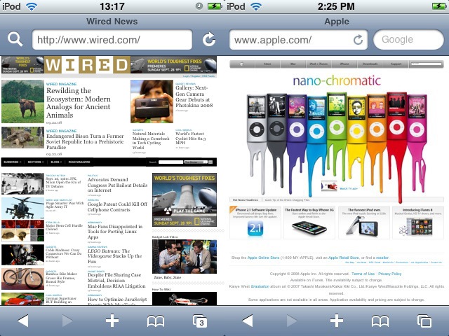
 Another concept I’d really love to see and experiment with is a dual screen format. Similar to that of the Nintendo DS. This would be perfect for a flip phone style smart phone. As phones can be made thinner folding them over is an option to keep the physical device small enough for portability but the display size can then be doubled. By the time the iPhone can be made half the thickness (remember the iPod G1 was much thicker than it is now) this is feasible.