Looks like the New Theme for Mac OS X just landed. So much better looking for Mac users. Awesome work. It’s looking more and more like a true Mac application.
Categories
Looks like the New Theme for Mac OS X just landed. So much better looking for Mac users. Awesome work. It’s looking more and more like a true Mac application.
Alex Faaborg has an awesome post on UI changes for Firefox 3.0. It’s a little lengthy, and most pics are wireframes but it’s a rewarding read for anyone in the browser space, or has an interest in user interface.
Overall I like most of the changes. I’ve been ranting about a need for a better bookmarking interface since 2005. Not sure if I was ahead of my time, or just impatient (likely the ladder), but it’s finally becoming a reality which I’m thrilled about. I’ve got some ideas on where it could go from here to make it even better, but that’s another post I hope to get to sometime.
One change that caught my eye is this:
-The lock is being removed from primary UI, and Firefox will now use a metaphor based on identity, rather than security, which will appear on the site button if an SSL or EV certificate is available. The super short explanation for this change is that the user might have an encrypted connection to criminals, so telling them that they are safe is a false cue. For an in-depth discussion of why we are moving away from the metaphor of a lock, watch Johnathan Nightingale’s Mozilla24 presentation Beyond the Padlock.
I’m not sure if this is really the best solution. I’d personally like to see the lock stay in the UI, but it’s meaning redefined. For a decade or more, the public has been told that the best way to tell if your information is safe is to look for the lock. I’d venture 99% of the general population doesn’t really know it symbolizes the use of SSL. They just know that it means your information is “safe”. My thinking is that it would be the most graceful transition to map that to the new identity system. Essentially the information it reveals would be the new identity information, but it provides backwards compatibility with previous versions, and other browsers. One less learning curve. Still in regards to safety, look for the lock.
Regarding the iconic form:
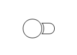
Image from Alex Faaborg The Shape of Things.
I could make a rather infantile joke, but I’ll leave that as an exercise for the reader.
Overall it’s some great progress. I think these changes allow for a much more functional user interface with added features and less UI. The native appearance will also be excellent for Mac and Linux users who have longed for a UI that looked “right” on their systems.
I got my copy of Mac OS X 10.5 earlier this week. Bought it from J&R (via Amazon) since it was $99 + shipping, less than Amazon itself was selling it for. For some reason both of them are able to undercut Apple (even with a corporate discount) which seemed odd. Here’s my rundown of the new OS during the first 24 hours.
Some real quick thoughts on UI this evening. This isn’t a very formal post but an attempt to get some thoughts out there.
So there’s talk of a new theme for Firefox on Mac OS X. According to some, it’s a clone of Safari. One must remember these are just early prototypes, not final UI by any stretch of the imagination.
I’m going to agree it’s got some similarities, but I don’t think there’s much choice if Firefox is to look like a native Mac OS X application. Originally Mac OS X preferred the “pinstripe” interface design. This is essentially what the current Mac OS X theme for Firefox is going for. I recall the pinstripe theme for Firefox even being considered a rip-off of other Mac OS X applications at the time. In more recent releases Apple has moved away from pinstripe and towards the “Brushed Metal ” interface. Apple in 10.5 is said to be moving away from Brushed Metal towards a “Unified” interface to address some perceived inconsistencies in the previous two UI schemes. There’s not to much on the web about Unified since 10.5 screenshots are forbidden under NDA, but you can catch a small glimpse via Apple’s Mac OS X pages for things like Mail and Finder. I’d consider it an incremental evolution from brushed metal, based on what I’ve seen thus far.
The application everyone seems to watch for cues to Apple UI standards seems to be iTunes/Quicktime. Which if you notice, even Safari resembles.
Consistency can be regarded as “boring”, but it does have an advantage. It’s becomes familiar quickly, and has less of a learning curve. It also makes applications seem more intuitive since UI elements are well understood. Apple wants this to encourage people to make the jump. Now more than ever (iPod effect).
That leaves the question: How do you blend in with the OS, while remaining unique? Especially one that’s looking to make things as simple as possible for the user by taking consistency to new levels. I personally think it’s all about making the easiest to use product out there, with the best features (not an easy combo). I don’t think most users are aren’t attracted to an “unique UI”. I think they are attracted to a clean, easy to use UI on an already great product. That’s not to say one shouldn’t be unique, or shouldn’t do a better job than others.
Perhaps it would be interesting to start a “user generated” brainstorm (yea, I threw in a “web 2.0 term”) similar to that of Gimp UI Redesign effort. Let users mock up what they think it should look like. If anyone wants to do so, feel free to do so (you can use free image hosting if needed) and leave a comment pointing to them. If someone wants to do so, I’ll gladly make a follow up post and put it on Planet Mozilla to get more eyes.
Edit [9/28/2007 @ 9:28PM EST]: Official wiki page for posting your mockups.
 I don’t see any reference on their blog, but it looks like the Google Reader team did an update to allow more than “100+” to appear. In my opinion this was the worst UI mistake in the product. This little change means quite a bit. Other than that, I can’t see any other changes. Polish is always a good thing.
Update [9/6/2007 @ 5:15 AM EST]: Search was added too. I caught them in the middle of a big update.
FishEyeTabs is an interesting way to make the situation of having many tabs open more usable. It’s not without it’s flaws (gets rid of the red “X” for example). I wonder if this would be beneficial or just annoying to users. I think personally the effect would be better on a longer delay so that it wasn’t so instant. You could just mouseover and see the title via a tooltip, but that’s not always intuitive especially for a casual user.
It’s always great to see innovative extensions like this.
[Via Lifehacker]
Once upon a time there were no icons for feeds. Many sites used orange  icon which really made no sense to the average user (what’s xml?). Then there was a feed icon
 ![]() . It then started to become a standard and webmasters were encouraged to adopt it. This was a great thing for users who want easy to find RSS feeds, and publishers who want users to easily find RSS feeds.
. It then started to become a standard and webmasters were encouraged to adopt it. This was a great thing for users who want easy to find RSS feeds, and publishers who want users to easily find RSS feeds.
Then the idea of an OPML icon. Now there’s the idea of a “Share This” icon and a Microsummary icon (which I could see being a standard as the feature is cool enough for adoption). Then there are MicroFormat Icons.
Standard icons are a good thing, they are one less thing a user has to learn to distinguish between sites/products. But I do wonder if there’s really a need for what seems to be a bunch of icons. My fear is that it will just become a rainbow of colored icons with simple shapes.
For the share icon you could of course question the sustainability of such “user generated content” or “social networking” sites, or just the need to launch into them. They aren’t standardized, a protocol, format, etc. We don’t have a specific icon for news, weather, blogs, or even somewhat standardized things like email or IM. Email and IM at least have some standards, even though IM isn’t shared across the board. There are trends for some of these that tend to be “universal symbols” such as a newspaper for news, envelope for mail, etc. But no standardized icon.
For microsummaries, and microformats, do we really expect users to directly interact with them? Or use them in a more subconscious fashion similar to the <title/> tag on a webpage.
I question how effective all the icons will really be to end users in the long run. I can see the feed icon persisting, since it’s represents two standards at the moment (RSS/Atom) that both do the same thing. Both the technology and the icons are well adopted to further solidify it’s status as a standard icon.
Is there a need for the rainbow?
I’m not accusing or criticizing, but wondering (out loud) what the likelihood of users recognizing all these square icons really is. Should there really be a “standard icon” for everything we do in Web 2.0 (as they call it)? Or should it be more informal like it is for email and news?
Should we have an icon to link (via anchor) to the part of your page where you show the various icons your site has? An icon-icon? Perhaps that’s worthy of a Photoshop contest.
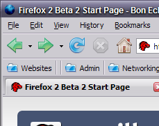
I was going to initially write this as a comment on Asa’s Blog, but decided to make a post out of it so can use some screenshots with ease. These are mainly opinions having tested the latest (20060911) on Windows XP, with a custom Windows theme. There may be bugs already filed on some of these, feel free to CC me. Feel free to file bugs against those which have none. Feel free to leave a comment on if you agree or disagree.
Some creative freedom was taken for the sake of me just not wanting to be 100% serious on this post.
First of all let me say it’s much better than it was previously. The previous revision looked pretty awkward, this is much smoother. So it’s clearly come a long way.
 I’m really not fond of the blue folders. They have a Aqua-like feel (but not quite), and it just doesn’t seem right for XP. Vista seems to be sticking with the yellow folder icon to symbolize a directory. Mac OS X seems to stick with the lighter blue so far for Leopard. So what influenced the dark blue? It just doesn’t seem to feel right.
Edit: beltzner says this will change.
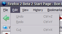
The is just a small glitch, but looks like the menu’s highlight extends too high, in comparison to Windows Explorer. That should be fixed.
Looking around Windows XP, and Windows Vista RC1 Screenshots (I haven’t installed Vista RC1 as of yet). I don’t see much reflecting this gradient mouseover effect that Windows XP did with Windows Explorer. It seems the trend for Windows goes two ways (in the applications I looked at):
Is this really the right effect for Windows XP and Vista?
Along with this, there is a giant difference between when the mouse is/isn’t over an icon on the toolbar, but the Go button, and the Search icon in the search box don’t have the same contrast. It’s actually somewhat hard to tell, especially compared to how obvious it is for the back, forward, reload, stop and home buttons.
A friend in High School was admittedly attracted to shiny objects. He even covered a textbook in aluminum foil (presumably perfect for burning ants and/or household pets). But is the Web 2.0 effect on the icons a little overdone? Mouseover looks fine, but otherwise it looks like the effect was a little abused, causing the top left of the home button to look a little washed out. Personally I think it should be more faded than looking like Uncle Jesse‘s hair. But maybe that’s just me. The blue folders mentioned above have this same problem.
This article tries to explain why some websites with really ugly designs do so well regarding usage. I think it dances around the reality of the situation. These sites are ugly because they weren’t professionally designed. They were implemented to be functional and to get into the marketplace (budget/time/resource limitations). The reason they are successful is because they were either: innovative, viral (word of mouth), or just plain useful.
Design doesn’t make or break a website, the ability to expose usability and functionality of your product in a way the user can grasp with minimal effort is what ultimately is important.
The sites mentioned (Craigslist, MySpace, and Google) all have rather humble beginnings. None were started by the big companies. They were created people with an idea, not a design.
I guess it’s all about how you view things. You can either be vein, or be functional. In my opinion the gifted are the ones who are rather balanced between the two.
Most have heard by now that Internet Explorer is adopting the Firefox RSS icon to standardize and help users who hate having to remember what equivalent icons are. Of course this is great for users. Though I wish they were a bit more consistent with their practices. UI design cross browsers is important simply for security purposes (as I will demonstrate). IE has apparently made some great strides in combating Phishing. What I disagree with, is how they implemented the UI. I think it’s confusing, and could easily be fixed, should they decide to do so.
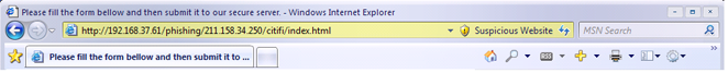
Their scheme essentially works by coloring the URL bar based on how suspicious the website is. Known scammers get red, suspected get yellow, and a potential good site would be green. This is obviously modeled after a traffic light.
What I dislike is how that can be confusing to the end user. Right now, the colored URL bar technique is used by Firefox and Opera to distinguish a secure website (since it’s more obvious than the little lock). Take a look at the little demo I have here:
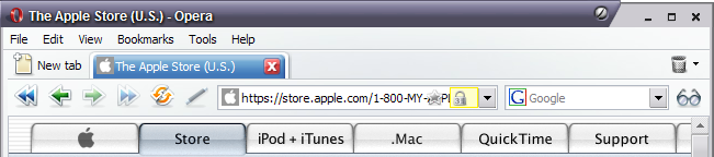
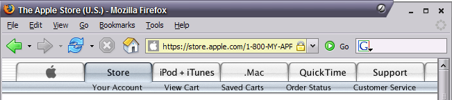
Screenshot from IE Blog.
For an end user, who doesn’t follow browser changes, and perhaps first encounters IE 7 at work, or in a public terminal. Seeing the yellow bar is familiar. We know that as being safe. I think many wouldn’t even notice the “Suspicious Website” text on the right side. The shield even looks a bit like the Lock icon in Firefox. Very confusing.
My suggestion is to use another color, in particular, one that I call “orange”. I release the color “orange” under a Public Domain License. Anyone may use it, however they may wish, no need to credit me 😉 (though I’d appreciate it).

This would distinguish the site as a possible fraudulent website, but still avoid using Yellow, which many users now view as “secure” aka “safe”. This solution solves the problem of conflicting UI design between browsers.