Alex Faaborg has an awesome post on UI changes for Firefox 3.0. It’s a little lengthy, and most pics are wireframes but it’s a rewarding read for anyone in the browser space, or has an interest in user interface.
Overall I like most of the changes. I’ve been ranting about a need for a better bookmarking interface since 2005. Not sure if I was ahead of my time, or just impatient (likely the ladder), but it’s finally becoming a reality which I’m thrilled about. I’ve got some ideas on where it could go from here to make it even better, but that’s another post I hope to get to sometime.
One change that caught my eye is this:
-The lock is being removed from primary UI, and Firefox will now use a metaphor based on identity, rather than security, which will appear on the site button if an SSL or EV certificate is available. The super short explanation for this change is that the user might have an encrypted connection to criminals, so telling them that they are safe is a false cue. For an in-depth discussion of why we are moving away from the metaphor of a lock, watch Johnathan Nightingale’s Mozilla24 presentation Beyond the Padlock.
I’m not sure if this is really the best solution. I’d personally like to see the lock stay in the UI, but it’s meaning redefined. For a decade or more, the public has been told that the best way to tell if your information is safe is to look for the lock. I’d venture 99% of the general population doesn’t really know it symbolizes the use of SSL. They just know that it means your information is “safe”. My thinking is that it would be the most graceful transition to map that to the new identity system. Essentially the information it reveals would be the new identity information, but it provides backwards compatibility with previous versions, and other browsers. One less learning curve. Still in regards to safety, look for the lock.
Regarding the iconic form:
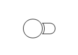
Image from Alex Faaborg The Shape of Things.
I could make a rather infantile joke, but I’ll leave that as an exercise for the reader.
Overall it’s some great progress. I think these changes allow for a much more functional user interface with added features and less UI. The native appearance will also be excellent for Mac and Linux users who have longed for a UI that looked “right” on their systems.