Categories
Around The Web Tech (General)

The Genius of Airline Baggage Tag Design

Slate has a great read on the design of airline baggage tags. My favorite part is the description of what the design needs to be able to deal with:

Let’s look first at how an ABT is made. In the interconnected, automated, all-weather world of modern aviation, tags must be resistant to cold, heat, sunlight, ice, oil, and especially moisture. Tags also can’t tear—and crucially, if they’re nicked, they must not tear further—as the bag lurches through mechanized airport baggage systems. And the tag must be flexible, inexpensive, and disposable. Plain old paper can’t begin to meet all these requirements. The winning combination is what IATA’s spokesperson described as a “complex composite” of silicon and plastic; the only paper in it is in the adhesive backing.

Bag tags must meet another set of contradictory requirements. They must be easy to attach, but impossible to detach—until, that is, the bag arrives safely at its destination and the traveler wants to detach it. Old tags were fastened with a string through a hole, but mechanized baggage systems eat these for breakfast. The current loop tag, a standardized strip of pressure-sensitive adhesive, looped through a handle and pressed to form an adhesive-to-adhesive bond, debuted with the ABT in the early ’90s. And the ABT, unlike string tags and earlier loop-y tag ideas, is easily attached to items that lack handles—boxes, say. Simply remove the entire adhesive backing and the loop tag becomes a very sticky sticker.

If you really think about it, it’s a pretty daunting set of requirements. The design they went with is not only quite simplistic and easy to print out it’s also quite effective.

While you can reduce it to a mundane sticker it’s a pretty impressive feat of engineering from the selection of a glue that can meet these requirements to a composite “paper”.

Categories
Around The Web

Raymond Loewy

LIFE magazine has a pretty interesting photo essay on Raymond Loewy, who designed many things you likely have seen/used but completely took for granted including the Exxon logo, Shell logo, Coca-Cola packaging, Lucky Strike packaging, Air France Concorde interior, and Skylab interior among many others. Just check out the Wikipedia article for a list of designs by decade. I’m not sure when the guy slept.

Categories
Google

Google Reader’s Inverted Unread Checkbox

I’m not sure who thought it would be a good idea to invert Google Reader’s “read” checkbox, but it’s confusing, and in my opinion an unnecessary UI change. Way to obscure. Before it “checked” meant it was read, unchecked was unread. Now it’s just the opposite. It could have went either way, but the quiet change just isn’t cool.

Read
Google Reader Read

Unread
Google Reader Unread

Categories
Mozilla

Firefox 3.0 Skinning Update

Back in January I posted some pics of the new skin in Firefox for those who haven’t tried it themselves. Figured I’d update with the latest.

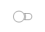
For the navigation toolbar the most obvious change is the new keyhole design. My only complaint is that the menu that appears when you click and hold isn’t as intuitive since the arrow isn’t there.

Navigation Toolbar (Windows XP)
Firefox 3.0 Toolbar on Windows XP

Navigation Toolbar (Mac OS X 10.4)
Firefox 3.0 Toolbar on Mac OS X Leopard

My only objection about the prefs is that the Windows privacy option is a great example of an icon that’s seemingly impossible to interpret what it’s supposed to represent. The light switch for “Main” is also a little odd, but I can manage with that much better than the privacy icon. Other than that, I think they look pretty good.

Options (Mac OS X 10.4)
Firefox 3.0 Prefs on Mac OS X Leopard

Options (Windows XP)
Firefox 3.0 Prefs on Windows XP

That’s all for now folks. If warranted, I’ll post again with updates.

Categories
Mozilla

Firefox 3 Skinning Progress

So I mentioned the other day that some theme related checkins took place. Here’s some screenshots for Mac/Windows for those interested. You can find some Linux screenshots on Michael Ventnor’s blog I’ve also got a little commentary on implementation thus far.

It should be noted that this stuff isn’t finalized and will definitely be tweaked. In the past things were adjusted until the very last moment, I expect we’ll see the same. Also don’t forget things like the planned keyhole shape aren’t even in place yet.

Navigation Toolbar (Windows XP)
Firefox 3.0b3 Toolbar (Windows XP)

My general thought on this is that Windows XP has thus far been left behind. Linux and Mac OS X look absolutely awesome. Vista doesn’t look to bad, though in general I think the OS design is an ugly turd. For XP, the reload and stop button are particularly what looks the strangest. Both seem to thin and small. It really doesn’t fit the rest of the UI. Home I think actually is actually an improvement. A step away from the “dirty house”. Back/Forward haven’t been updated yet as I mentioned before.

Navigation Toolbar (Mac OS X 10.4)
Firefox 3.0b3 Navigation Toolbar (Mac)

Simply awesome. Enough said. Not even shown is the new tab design which is also better. I’ve got to put together a screenshot post of Mac OS X thus far so others can drool.

Options (Windows XP)
Firefox 3.0b3 Options (Windows XP)

I think this overall is better than the toolbar. I still have a few issues with it. For one the “Main” icon abstractly looks like a switch, but I’m not sure how apparent that is if you didn’t know what it was supposed to be. “Tabs” looks slightly distorted (that’s one tall tab) but otherwise good. I like the concept behind “Content” but I’m not sure I can tell what any of that is. Images is clearly in there, it would be nice if it was more obvious you can control popups from in there. “Applications” seems to work well. I’m really not even sure what “Privacy” is supposed to depict. Anyone know? “Security” and “Advanced” also very nice.

Options (Mac OS X 10.4)
Firefox 3.0b3 Preferences (Mac)

It’s pretty much the same old, nothing to report here. Looks good.

So there you have it. My 5 minute rundown of some icon changes. There will be more, and a lot more polish I’m sure. I’ll try and post a follow up later on and show how it’s changed. For anyone who hasn’t seen it yet, hopefully this gives you a little taste of the great UI design work being done.

Categories
Mozilla

The Shape Of Firefox 3.0

Alex Faaborg has an awesome post on UI changes for Firefox 3.0. It’s a little lengthy, and most pics are wireframes but it’s a rewarding read for anyone in the browser space, or has an interest in user interface.

Overall I like most of the changes. I’ve been ranting about a need for a better bookmarking interface since 2005. Not sure if I was ahead of my time, or just impatient (likely the ladder), but it’s finally becoming a reality which I’m thrilled about. I’ve got some ideas on where it could go from here to make it even better, but that’s another post I hope to get to sometime.

One change that caught my eye is this:

-The lock is being removed from primary UI, and Firefox will now use a metaphor based on identity, rather than security, which will appear on the site button if an SSL or EV certificate is available. The super short explanation for this change is that the user might have an encrypted connection to criminals, so telling them that they are safe is a false cue. For an in-depth discussion of why we are moving away from the metaphor of a lock, watch Johnathan Nightingale’s Mozilla24 presentation Beyond the Padlock.

I’m not sure if this is really the best solution. I’d personally like to see the lock stay in the UI, but it’s meaning redefined. For a decade or more, the public has been told that the best way to tell if your information is safe is to look for the lock. I’d venture 99% of the general population doesn’t really know it symbolizes the use of SSL. They just know that it means your information is “safe”. My thinking is that it would be the most graceful transition to map that to the new identity system. Essentially the information it reveals would be the new identity information, but it provides backwards compatibility with previous versions, and other browsers. One less learning curve. Still in regards to safety, look for the lock.

Regarding the iconic form:
Iconic Form

Image from Alex Faaborg The Shape of Things.

I could make a rather infantile joke, but I’ll leave that as an exercise for the reader.

Overall it’s some great progress. I think these changes allow for a much more functional user interface with added features and less UI. The native appearance will also be excellent for Mac and Linux users who have longed for a UI that looked “right” on their systems.

Categories
Mozilla

Milestone Tracking

Does anyone know of a way to get Bugzilla to give output similar to how Trac can report on milestones?

That is a really great way of viewing things. It lets you know where the release stands really easily.

Categories
Hardware

The ports keep marching forward

I’m a strong believer that form = function. A well designed product just works better.

My T43 is a fairly well designed computer, minus it’s few shortcomings. Now take a look at the T60, which I just don’t understand. Why is the VGA port half way down the side of the laptop? Why is USB so far down the left side? Why is Ethernet there?

Perhaps they are operating under the idea that everyone uses their laptop on the go, and nobody uses it at a desk. But personally I find even the T43’s Ethernet (which is further to the back on the left side) a little annoying. I think the new positioning is just asking for it to get hit and broken.

Am I the only one who likes the cables in the back (out of the way)?

Hopefully they at least figured out that using an SATA drive would be a good idea. That way they get rid of those 2010 errors plaguing T43 owners.

I do however like that they kept the same simple design, rather than go with the glow-in-the-dark plastic with flashing lights design that many seem to like.