It’s interesting to watch mobile web browsing UI develop. This is really the first time since web browsers existed that they have received a large overhaul. Sure things like tabs are “major”, but when you really look at it, Safari, Chrome, IE, Firefox are all strikingly similar to the original Mosaic (this is 1.0 running on Windows XP):
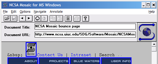
I’m not sure who’s idea it was to put the title in the UI like that, especially in a time when displays were small. That was a gigantic waste of space. The address bar in this version is read only, you need to select open and enter your URL there. Other than that, it’s pretty much the same browser UI since 1993. That’s right, 15 years of really the same user interface. The window to the web has always looked that way. There’s now bookmarking, a fancier address bar, favicons, and a search box. Firefox goes nuts by letting users install add-ons. Overall: Not very different.
There’s a few reasons why it hasn’t changed too much. First of all, it’s a pretty good design. Minus some quirks which were worked out pretty fast, it’s effective. If it wasn’t the web wouldn’t have caught on. Secondly, people know how to use it already. Why make people re-learn?
The mobile space is different yet surprisingly the same. Like days of old there’s a need to conserve screen space. Unlike days of old there’s no reason to believe it will get bigger since small phones are always desirable. Until screens are foldable, the iPhone is about as big as you’ll see. Even when phones get thinner and lighter, the screen size won’t likely get any larger since it will be awkward to hold and put in your pocket.
With a touch screen you can only make items in the UI as small as a fingerprint. Any smaller and they are unusable to people. A stylus while clunkier and more awkward allows for a much more compact UI. This leaves very little space to get a lot accomplished. Too add to the complexity of the problem websites are designed for big displays meaning there’s a lot to cram into a small space.
Apple’s allegedly making a pretty interesting change to iPhone 2.2. Safari will break out the search box into a more desktop-like separate box. This results in a smaller address bar and the reload icon being moved inside the url bar. I think the reason for this is to better parody the desktop, and remind users they can search from the browser chrome.
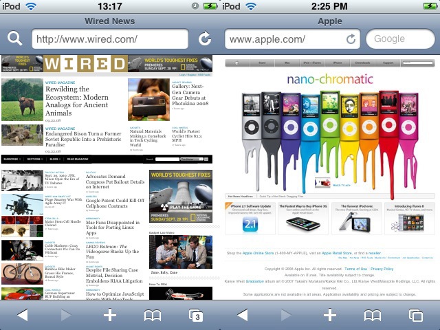
To be perfectly honest, I’m not sure the address bar is even needed in a mobile browser on a touchscreen device. Unlike a desktop you can’t type directly into it because of the small size. Your essentially going to another UI to enter the text anyway. Why not just make it a button? You could argue you need the address bar as a way to know where you are. Of course you can likely merge it with the Title to accomplish that. All that’s needed in the main UI is the title and hostname. That can be all in the title of the window. I think I’d prefer a back button more than the address bar on a mobile device. Of course if I could tap or tilt the device to go backwards or forwards that would be cool too. One less thing for the UI.
The most similar to this is Fennec.
On a side note, thanks to Apple’s insane SDK licensing and app store policy it is unlikely to ever live on an iPhone. Maybe one day Apple will realize that just like 3rd party applications (something they were originally against), an even more open device would be even more enticing. But I digress.
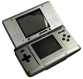 Another concept I’d really love to see and experiment with is a dual screen format. Similar to that of the Nintendo DS. This would be perfect for a flip phone style smart phone. As phones can be made thinner folding them over is an option to keep the physical device small enough for portability but the display size can then be doubled. By the time the iPhone can be made half the thickness (remember the iPod G1 was much thicker than it is now) this is feasible.
There are several fun things about this design. First of all you essentially Optimus Maximus keyboard on your phone. Secondly you can now separate the content from the chrome in applications. Perfect for things like web browsers. This is also handy for watching movies as controls don’t overlay video but are still available. It also would be great for multi-tasking.
That’s where I predict things will ultimately go. We’re once again in the era of Bar form phones. Anyone remember the Nokia 1100/5110/3210/3310 fad a few years ago? Then flip phones came back in style. The flip phone style also has the advantage of protecting the internal display from scratches and involuntary button pressing.
It will be fun to see how the interface evolves. I’m relatively certain despite all the different UI prototypes surfacing right now regarding web browsers, as they mature they will adopt features from each other and become surprisingly similar to each other.
iPhone Safari image via Wired. Nintendo DS image via Wikipedia Commons]