As a frontend developer I’ve long argued the magic formula for a good website is:
Usefulness + Speed = Users
This is based on the fact that the best websites on the internet are pretty spartan in appearance. When you look at many of the successful ones (Google, Yahoo, Craigslist, Facebook), they’ve all taken the approach of simplicity on the frontend. They keep the user interface as minimal as possible, and they keep the technology and code as minimal as possible.
An interesting quote from CNet:
The same effect happened with Google Maps. When the company trimmed the 120KB page size down by about 30 percent, the company started getting about 30 percent more map requests. “It was almost proportional. If you make a product faster, you get that back in terms of increased usage,” she said.
Emphasis mine.
Just goes to show that faster things become more than useful to users. They become a convenience. Users don’t really care how it looks or they would have switched from boring Google a long time ago. They just find it so convenient and quick they can’t stop using it.
I suspect this is why digital clocks are so popular.
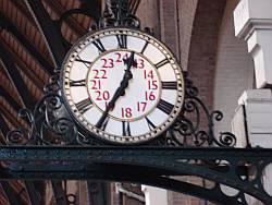
Most people find an analog clock to be “classy”, in particular when there are roman numerals. But when you come down to being practical, they aren’t as quick to read for most people since we rarely deal with roman numerals. The solution used to be using Arabic numbers to increase usability and speed:

This is better, but not perfect. Still slow to read, and your estimating the minutes. These days, we have the technology to produce low cost digital time readouts with Arabic numbers. These are more accurate since they show the minutes, and maybe even seconds, and can be read at a glance with almost no effort.
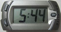
Despite hardly looking fancy, this is what you see in most train stations, airports, etc. The older clocks are still around, but mostly for aesthetic purposes. People are willing to sacrifice looks for convenience. That’s why they walk around with digital watches rather than the more classy ones. Both can be found for cheap, but one can easily be read (even with poor vision, and in the dark).
Simplicity always rules. Unless your a nerd with a binary clock (which is cool).
I suspect this rule also holds true for software. If it’s faster, people are more inclined to use it. People moved from IE 6 to Firefox because it’s faster. Given that Firefox 3 is even faster… I’m hoping this trend will be proven yet again with an improved adoption rate.
Another upcoming test of this principle will be the Apple’s 3G iPhone. Will the average number of minutes browsing the web increase with the additional speed of a 3G network? Will faster performance make people use the device more? I suspect so. I also think it will increase adoption as many people were turned off on the idea of spending that much for EDGE. For 3G, that’s a different story.
It’s really pretty interesting stuff. People often associate usability with user interface design, and never performance. But that data really does seem to point to performance being one of the easiest ways to make a product more usable.
Images: Grand Central Terminal clock © 2004 Metropolitan Transportation Authority, Clock in Kings Cross, LCD Clock Grey via Wikipedia
7 replies on “Usefulness + Speed = Users”
“aesthetic”. And your email validator is broken.
If 3.0 ever comes out. The development process has certainly not been speedy.
While I agree on your points about usefulness and speed I do think that the clock is a really bad example. A well designed analog clock (e.g. the swiss railways clock, http://farm1.static.flickr.com.....f6d929.jpg) gives you all the desired information immediately. A digital clock is only faster if you want to read an exact time quickly to someone else: “It’s 13:16″ (or ” “It’s 1:16 pm” for those who can’t count that far 🙂 ). But the analog clock immediately tells you that you have three quarters of an hour left until the next full hour, that it’s early afternoon (clear from context) etc. I often just glimpse at an analog clock without really “reading the time”, but just judging “the progress of the time of day”. This more subtle way of gaining time information requires more thinking on your part with a digital clock.
I’m with Arthur on this one.
Whilst it may be easier to glance at your digital watch and tell an enquiring passer-by that the time is 12:15, a mre half-hour later you’ll be doing some mental arithmetic and translating what your digital device tells you into the phrase “it’s a quarter to one”.
Once you’ve learnt it, an analogue watch is far easier than a digital one.
Phil, proud owner of a watch with moving hands.
You would think the concept is so simple…
Just make sure the site isn’t ugly. It doesn’t have to look good. Have usability in it, and make sure it goes fast.
I created a mockup of a hybrid digital and analog clock some years ago: http://surfmind.com/lab/flash/.....clock.html.
While digital is easier to read, sometimes the user goal is less precise and the overall shape of the analog clock may render a quicker assessment.
Regarding the bigger issue, this is a good insight. There’s a lot more to the picture, but the role of design and novelty in attracting users is often over-estimated.
I’m with Arthur on the clocks, too. For railway stations I’d prefer a digital clock, but I’m more comfortable with an analog wristwatch. I also often find it easier to do time conversions on an analog wristwatch because I can do them geometrically.