Categories
Google

Google Glasses For True In Your Face Advertising

Google Glasses or Google Goggles will likely suffer the same limitation that despite its success hinder the iPad: Bandwidth. Unlike an iPad however which is a great couch surfing device, and very usable offline, the glasses are really best suited for outdoors use where augmented reality and real-time cloud data could make use of such an interface.

People don’t mind adopting strange new UI’s when they work well. The iPhone is a great example of that. A tiny touch screen display works well. Uses had no problem adapting to it. I don’t think glasses are anything different. If it’s intuitive and works well, uses will be fine with that.

Supplying them with data however is another story. WiFi is hardly abundant in most of the US. Much of it is paid, or only available with a cellular data plan for the device. Cellular data service is still very expensive. I don’t think there is any bluetooth profile outside of PAN (tethering) that would work and be acceptable to cellular providers. So piggybacking off of your cell phones data plan is unlikely.

Google could go the Kindle route and make connectivity free with purchase of the device, then largely lock it down to Google services. Since Google uses advertising they would be able to subsidize that expense.

The other issue is power, I wonder if Google is able to cram enough battery into a small enough package to make this all workable.

I’d like to try it. I hope it succeeds. However looking at the big picture there is a fundamental issues. Of course there are privacy issues as well, but that’s another topic.

Categories
Mozilla

Things You’ll Love About Firefox 4.0

It’s that time again. Here’s my list of awesome things you’ll love about Firefox 4:

For Users

New Look For Tabs

New Tabs For Firefox 4
One of the first things that you’ll notice is tabs on top. This paradigm really makes more sense since the tab defines not just the content but the environment it’s viewed (prev/next button, URL bar). It’s also just much sleeker looking. After a few minutes you’ll likely agree this is a better approach than tabs under.

Another nice touch is if you enter a URL that’s already open in another tab, you’ll be given the option to switch to that tab. Perfect for those of us who end up with 50 tabs by lunch time.

It also just feels tighter and less intrusive on the web browsing experience.

Categories
Google

Google Instant = Web Command Line Interface

“What’s old is new again” the saying goes. Google Instant is a pretty interesting UI change. One of the big things mentioned is that all you need to do is type “w” and you’ll see the local weather. A way to get information by just typing… some of us know that as command line interface.

Essentially we’re seeing Google move from a point & click UI to almost a command line UI. For ages the focus was automatically set on the search box, no need to click on it. Just type, press enter or as I’m sure many (if not the majority did) mouse over the “search” button and click on it and you got search results. It’s just another step forward in simplifying the process. This is one less interaction (pressing search).

It’s interesting to see a less mouse centric UI develop after decades of anti-keyboard UI. For those of us comfortable typing quickly and using keyboard shortcuts constantly it’s a constant nuisance when applications don’t handle shortcuts nicely. We’re now seeing an effort to reduce use of the mouse, even if it’s just to press the “Search” button. One less reason to take your hands off the keyboard.

One interesting quirk I’ve noticed is Google’s calculator (the ability to type a math problem into Google and get an answer) just feels awkward and unpolished. I suspect they will improve upon that shortly. This can vastly improve the utility of these little applications. Google has several little apps built into its search (try typing “movies” for example). It’s just that much easier to use.

Categories
Apple Mozilla

Mobile Browsing UI

It’s interesting to watch mobile web browsing UI develop. This is really the first time since web browsers existed that they have received a large overhaul. Sure things like tabs are “major”, but when you really look at it, Safari, Chrome, IE, Firefox are all strikingly similar to the original Mosaic (this is 1.0 running on Windows XP):

NCSA Mosaic UI

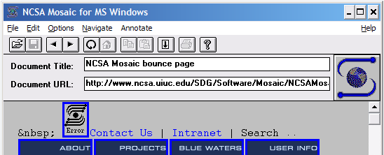
I’m not sure who’s idea it was to put the title in the UI like that, especially in a time when displays were small. That was a gigantic waste of space. The address bar in this version is read only, you need to select open and enter your URL there. Other than that, it’s pretty much the same browser UI since 1993. That’s right, 15 years of really the same user interface. The window to the web has always looked that way. There’s now bookmarking, a fancier address bar, favicons, and a search box. Firefox goes nuts by letting users install add-ons. Overall: Not very different.

There’s a few reasons why it hasn’t changed too much. First of all, it’s a pretty good design. Minus some quirks which were worked out pretty fast, it’s effective. If it wasn’t the web wouldn’t have caught on. Secondly, people know how to use it already. Why make people re-learn?

The mobile space is different yet surprisingly the same. Like days of old there’s a need to conserve screen space. Unlike days of old there’s no reason to believe it will get bigger since small phones are always desirable. Until screens are foldable, the iPhone is about as big as you’ll see. Even when phones get thinner and lighter, the screen size won’t likely get any larger since it will be awkward to hold and put in your pocket.

With a touch screen you can only make items in the UI as small as a fingerprint. Any smaller and they are unusable to people. A stylus while clunkier and more awkward allows for a much more compact UI. This leaves very little space to get a lot accomplished. Too add to the complexity of the problem websites are designed for big displays meaning there’s a lot to cram into a small space.

Apple’s allegedly making a pretty interesting change to iPhone 2.2. Safari will break out the search box into a more desktop-like separate box. This results in a smaller address bar and the reload icon being moved inside the url bar. I think the reason for this is to better parody the desktop, and remind users they can search from the browser chrome.

iPhone 2.2 Safari With Search Box

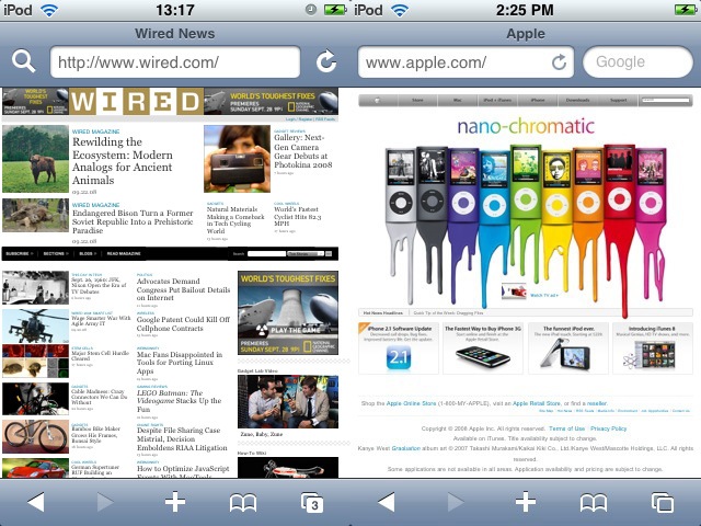
To be perfectly honest, I’m not sure the address bar is even needed in a mobile browser on a touchscreen device. Unlike a desktop you can’t type directly into it because of the small size. Your essentially going to another UI to enter the text anyway. Why not just make it a button? You could argue you need the address bar as a way to know where you are. Of course you can likely merge it with the Title to accomplish that. All that’s needed in the main UI is the title and hostname. That can be all in the title of the window. I think I’d prefer a back button more than the address bar on a mobile device. Of course if I could tap or tilt the device to go backwards or forwards that would be cool too. One less thing for the UI.

The most similar to this is Fennec.

On a side note, thanks to Apple’s insane SDK licensing and app store policy it is unlikely to ever live on an iPhone. Maybe one day Apple will realize that just like 3rd party applications (something they were originally against), an even more open device would be even more enticing. But I digress.

Nintendo DS
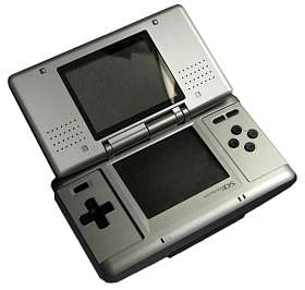
Another concept I’d really love to see and experiment with is a dual screen format. Similar to that of the Nintendo DS. This would be perfect for a flip phone style smart phone. As phones can be made thinner folding them over is an option to keep the physical device small enough for portability but the display size can then be doubled. By the time the iPhone can be made half the thickness (remember the iPod G1 was much thicker than it is now) this is feasible.

There are several fun things about this design. First of all you essentially Optimus Maximus keyboard on your phone. Secondly you can now separate the content from the chrome in applications. Perfect for things like web browsers. This is also handy for watching movies as controls don’t overlay video but are still available. It also would be great for multi-tasking.

That’s where I predict things will ultimately go. We’re once again in the era of Bar form phones. Anyone remember the Nokia 1100/5110/3210/3310 fad a few years ago? Then flip phones came back in style. The flip phone style also has the advantage of protecting the internal display from scratches and involuntary button pressing.

It will be fun to see how the interface evolves. I’m relatively certain despite all the different UI prototypes surfacing right now regarding web browsers, as they mature they will adopt features from each other and become surprisingly similar to each other.

iPhone Safari image via Wired. Nintendo DS image via Wikipedia Commons]

Categories
Mozilla Security

Unobstructed HTTPS

There’s an interesting discussion on Slashdot about SSL certificates. It brings up two valid points:

  1. Invalid certificates, while providing a secure mechanism between the client/server are extremely annoying to use in Firefox 3 for many people because of the multi-step process. Previously it was just a warning dialog.
  2. There are no free SSL certificates that are really “usable” (not throwing up warnings in a many browsers). CAcert.org has likely gotten the most inclusion, but it’s barely anywhere.

Certificates not signed by a trusted certificate authority (CA) give up a warning because of the idea that a certificate authority verifies the certificate belongs to the person whose name is on the certificate. This concept was busted a while back as CA’s started doing “domain validation” to offer lower prices. To “remedy” this, they created EV SSL. EV SSL requires more background checking, but at a higher cost. This means there are three tiers of SSL:

  1. Untrusted/Self Signed – Free – The user is strongly discouraged from visiting a site with one of these. Indicates the technologically the channel is secure only.
  2. Signed By CA – Variable Pricing – The user is told this is secure.
  3. EV SSL – Expensive – The user is told these sites are super awesomely amazing and can cure cancer.

Essentially EV SSL is nothing more than a scheme to charge more. EV SSL is supposed to do what a signed certificate should have been doing all along. By 2012 I’d bet there will be a SEV SSL(Super Extended Validation Certificate). Maybe that would require a DNA and fingerprints to prove identity.

The Problem

It’s 2008 (actually more than half way through it). I still can’t use a secure https connection without either throwing up an error to users (who are always confused by it), or paying a fee? It seems right to me it should be free to use https without any barrier for a technical level of security.

Why is “trust” bound so tightly to encryption? Why can’t a medium be encrypted without being trusted? The technology shouldn’t be tied the way it is to the business side of things.

Trust should be bound to encryption, but encryption should not be bound to trust. Trust is the “needy” individual in this relationship. Encryption is strong and confident. At least it should be…

A modest proposal

I propose that browsers should allow for self signed certificates to be used without any dialog, interstitial or other obstruction provided they are properly formed and not expired. The user interface should indicate that the channel is encrypted and communication is unlikely to be intercepted between the user and the server. It should note if there is any change (just like SSH notifies the user if the signature is changed between sessions). Other than that it should be transparent.

SSL certificates and EV SSL certificates should indicate in the user interface the the site being browsed is not only encrypted, but trusted by a third party the browser trusts. These are suitable for ecommerce, banking etc.

This would allow for things like intranets and other places where encryption is desired, paying for a CA to verify identity is overkill, and “domain verification” is just pointless.

Trust should be bound to encryption. Encryption shouldn’t be bound to trust. Encryption shouldn’t require verification. Encryption should be self-serve.

I’d be curious to know what others thought of the issue.

Categories
Mozilla

AT&T’s Pogo Browser

You may or may not have heard about AT&T’s Pogo Browser. It’s a “3D Visual Web Browser” (make of that what you will). TechCrunch reviewed it a little while back. It’s based on Firefox (2.0.0.14 to be exact). It has some interesting UI for bookmarking, but other than that, I’m going to have to agree with TechCrunch. I’m really not very impressed.

The impression I’m left with is simply: why wasn’t this created as an extension?

Categories
Mozilla

Firefox 3.0 Is Out

Firefox

So the servers had a giant melt down. That’s hopefully history now. It’s out! Go download it. While your at it, spread the word and help break a world record. After all, how many world records have you participated in so far?

  • Awesomebar – Find what you want easier than ever.
  • Malware Protection – Stay safer when browsing the web
  • Native UI Appearance – It looks better than ever.
  • Better Addons/Plugins Manager – Manage plugins with ease, find new addons.
  • Download Manager – Resumable downloads!
  • Smart Bookmarks – Most visited, recently bookmarked, recently tagged.
  • Better Memory Management – Nuff said
  • Powered By Robots Not only are they awesome, they obey the Three Laws of Robotics

See Deb Richardson’s Field Guide to Firefox 3 for more details.

Categories
Google

Google Reader’s Inverted Unread Checkbox

I’m not sure who thought it would be a good idea to invert Google Reader’s “read” checkbox, but it’s confusing, and in my opinion an unnecessary UI change. Way to obscure. Before it “checked” meant it was read, unchecked was unread. Now it’s just the opposite. It could have went either way, but the quiet change just isn’t cool.

Read
Google Reader Read

Unread
Google Reader Unread

Categories
Mozilla

Firefox 3.0 Skinning Update

Back in January I posted some pics of the new skin in Firefox for those who haven’t tried it themselves. Figured I’d update with the latest.

For the navigation toolbar the most obvious change is the new keyhole design. My only complaint is that the menu that appears when you click and hold isn’t as intuitive since the arrow isn’t there.

Navigation Toolbar (Windows XP)
Firefox 3.0 Toolbar on Windows XP

Navigation Toolbar (Mac OS X 10.4)
Firefox 3.0 Toolbar on Mac OS X Leopard

My only objection about the prefs is that the Windows privacy option is a great example of an icon that’s seemingly impossible to interpret what it’s supposed to represent. The light switch for “Main” is also a little odd, but I can manage with that much better than the privacy icon. Other than that, I think they look pretty good.

Options (Mac OS X 10.4)
Firefox 3.0 Prefs on Mac OS X Leopard

Options (Windows XP)
Firefox 3.0 Prefs on Windows XP

That’s all for now folks. If warranted, I’ll post again with updates.

Categories
Mozilla

Firefox 3 Skinning Progress

So I mentioned the other day that some theme related checkins took place. Here’s some screenshots for Mac/Windows for those interested. You can find some Linux screenshots on Michael Ventnor’s blog I’ve also got a little commentary on implementation thus far.

It should be noted that this stuff isn’t finalized and will definitely be tweaked. In the past things were adjusted until the very last moment, I expect we’ll see the same. Also don’t forget things like the planned keyhole shape aren’t even in place yet.

Navigation Toolbar (Windows XP)
Firefox 3.0b3 Toolbar (Windows XP)

My general thought on this is that Windows XP has thus far been left behind. Linux and Mac OS X look absolutely awesome. Vista doesn’t look to bad, though in general I think the OS design is an ugly turd. For XP, the reload and stop button are particularly what looks the strangest. Both seem to thin and small. It really doesn’t fit the rest of the UI. Home I think actually is actually an improvement. A step away from the “dirty house”. Back/Forward haven’t been updated yet as I mentioned before.

Navigation Toolbar (Mac OS X 10.4)
Firefox 3.0b3 Navigation Toolbar (Mac)

Simply awesome. Enough said. Not even shown is the new tab design which is also better. I’ve got to put together a screenshot post of Mac OS X thus far so others can drool.

Options (Windows XP)
Firefox 3.0b3 Options (Windows XP)

I think this overall is better than the toolbar. I still have a few issues with it. For one the “Main” icon abstractly looks like a switch, but I’m not sure how apparent that is if you didn’t know what it was supposed to be. “Tabs” looks slightly distorted (that’s one tall tab) but otherwise good. I like the concept behind “Content” but I’m not sure I can tell what any of that is. Images is clearly in there, it would be nice if it was more obvious you can control popups from in there. “Applications” seems to work well. I’m really not even sure what “Privacy” is supposed to depict. Anyone know? “Security” and “Advanced” also very nice.

Options (Mac OS X 10.4)
Firefox 3.0b3 Preferences (Mac)

It’s pretty much the same old, nothing to report here. Looks good.

So there you have it. My 5 minute rundown of some icon changes. There will be more, and a lot more polish I’m sure. I’ll try and post a follow up later on and show how it’s changed. For anyone who hasn’t seen it yet, hopefully this gives you a little taste of the great UI design work being done.