Alex Faaborg has an awesome post on UI changes for Firefox 3.0. It’s a little lengthy, and most pics are wireframes but it’s a rewarding read for anyone in the browser space, or has an interest in user interface.
Overall I like most of the changes. I’ve been ranting about a need for a better bookmarking interface since 2005. Not sure if I was ahead of my time, or just impatient (likely the ladder), but it’s finally becoming a reality which I’m thrilled about. I’ve got some ideas on where it could go from here to make it even better, but that’s another post I hope to get to sometime.
One change that caught my eye is this:
-The lock is being removed from primary UI, and Firefox will now use a metaphor based on identity, rather than security, which will appear on the site button if an SSL or EV certificate is available. The super short explanation for this change is that the user might have an encrypted connection to criminals, so telling them that they are safe is a false cue. For an in-depth discussion of why we are moving away from the metaphor of a lock, watch Johnathan Nightingale’s Mozilla24 presentation Beyond the Padlock.
I’m not sure if this is really the best solution. I’d personally like to see the lock stay in the UI, but it’s meaning redefined. For a decade or more, the public has been told that the best way to tell if your information is safe is to look for the lock. I’d venture 99% of the general population doesn’t really know it symbolizes the use of SSL. They just know that it means your information is “safe”. My thinking is that it would be the most graceful transition to map that to the new identity system. Essentially the information it reveals would be the new identity information, but it provides backwards compatibility with previous versions, and other browsers. One less learning curve. Still in regards to safety, look for the lock.
Regarding the iconic form:
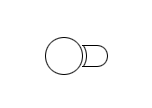
Image from Alex Faaborg The Shape of Things.
I could make a rather infantile joke, but I’ll leave that as an exercise for the reader.
Overall it’s some great progress. I think these changes allow for a much more functional user interface with added features and less UI. The native appearance will also be excellent for Mac and Linux users who have longed for a UI that looked “right” on their systems.
3 replies on “The Shape Of Firefox 3.0”
Preserving the lock but changing its meaning would open Mozilla to a wealth of criticism about misleading internet users. IMO it has been a mistake from the start to tell people that SSL = “safe”, and it should have been stopped long ago. Instead the lock and other SSL UI has become more and more prominent over time, further reinforcing this misconception. If we ever want people to be truly safe, the cycle must be broken, and sooner is easier.
I think the whole point of removing the lock was that they didn’t want people saying “Still in regards to safety, look for the lock.” An encrypted connection is not necessarily safe. I’m more in favor of trying to explain things to users though, rather than just remove them. There should be a way to visually show users that data is being encrypted. There should be an someway to visually explain to users that FF does (or more importantly does not) know who its sending that encrypted info to. Neither of those should imply anything to the user about whether or not a site is safe. The present solution just seems like a… compromise between UI people are used to, and UI that is actually useful.
I totally understand that, but I’ll offer a few points to consider, on the off chance that you haven’t already. First off, 99% of the general public doesn’t notice the lock, understanding or no. Sad, but repeatably demonstrated in academic research like http://people.deas.harvard.edu....._works.pdf . Those that do are as likely to trust the ones in content as the one in chrome. The same studies find that the vast majority of people do look to the location bar for identity information though, so hope is not lost if we can find a way of communicating more clearly (and non-annoyingly) in the places users already look.
Second, as other commenters have beaten me to pointing out, the lock DOESN’T mean “safe” and that’s the problem. Ask non-sophisticated users, and they have all kinds of expectations about what that lock means that aren’t borne out by what it actually represents. Telling them to look for the lock to know they’re safe is the big lie we’ve been telling, and that’s something that I don’t think we should do. It makes them feel safer without being safer – I like making people feel safe, but I don’t like them being spoofed by the bankofamerica phishing site that actually goes and buys a $20 cert (though see above, that’s rarely necessary since most people don’t notice.)
Last, I’ll point out that I’m not at all immune to the argument that even if we think we’re going in a better direction, weaning people off what they’re used to should be done gently. Clicking the site button popups up an identity dialog, which includes, when the connection is encrypted, a padlock which says as much. The padlock is fine as a symbol for encryption, but encryption is not the same as safety, and giving encryption so much top-billing as safety does users a disservice. It is also, incidentally, still in the status bar. Baby steps.
Johnath